The Dove 2025 Brand Refresh focused on evolving the brand’s visual identity to feel more contemporary and relevant within a fast-moving social world, while staying true to Dove’s core ethos. The brief was to update the branding, colour palette and typography so they worked seamlessly across social, broadcast, print and POS, creating a more flexible and unified system.
Central to the refresh was the development of clearer talent and product photography guidelines, bringing greater consistency to the work while continuing to celebrate real women in an honest, considered way. The updated photography balances realness and confidence, ensuring the brand feels both human and recognisably Dove.
A full suite of social and motion guidelines was also created, defining layout, typography, transitions and rhythm to ensure the visual world feels cohesive in both static and moving formats. The result is a unified design system that allows Dove to show up consistently and confidently across every platform.
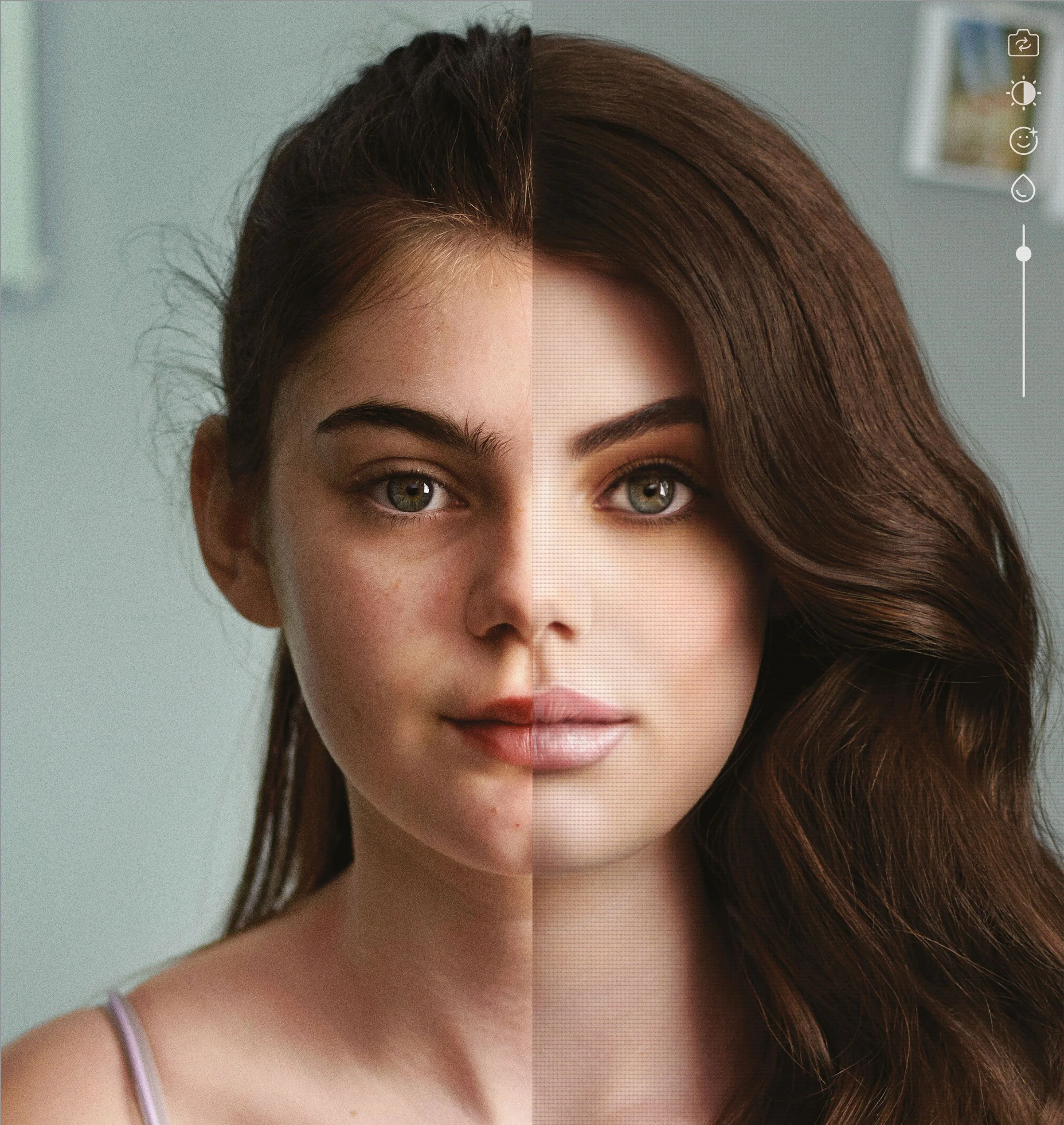
80% of girls are now using retouching apps by the age of 13, according to research.
Dove Reverse Selfie was created to challenge the growing impact of social media distortion on young people’s self-esteem. The brief was to spotlight how filters and editing tools subtly reshape reality, and to do so in a way that felt honest, emotional and unmistakably Dove.
By reversing the familiar process of creating a “perfect” selfie, the campaign exposed the unseen steps behind online images and reinforced Dove’s long-standing commitment to real beauty — encouraging audiences to question what they see on screen and to feel more confident in their own skin.
My Role: Design Director
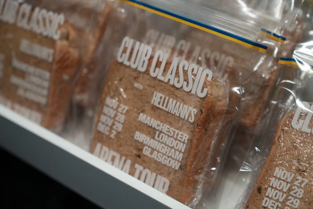
The idea was to turn a piece of internet culture into a physical design object. A banned sandwich bag from Charli xcx’s poster was recreated as a limited-edition Hellmann’s ‘Club Classic’ sandwich bag, designed to feel almost identical to the original and filled with a freshly made Club Classic sandwich — a playful nod to the track.
Executed as a fast, guerrilla-style drop, the bags were produced in limited numbers and distributed directly to fans outside the venue. Designed to feel like merch rather than advertising, the object became instantly collectible, living naturally within fan culture and social feeds rather than traditional brand spaces.
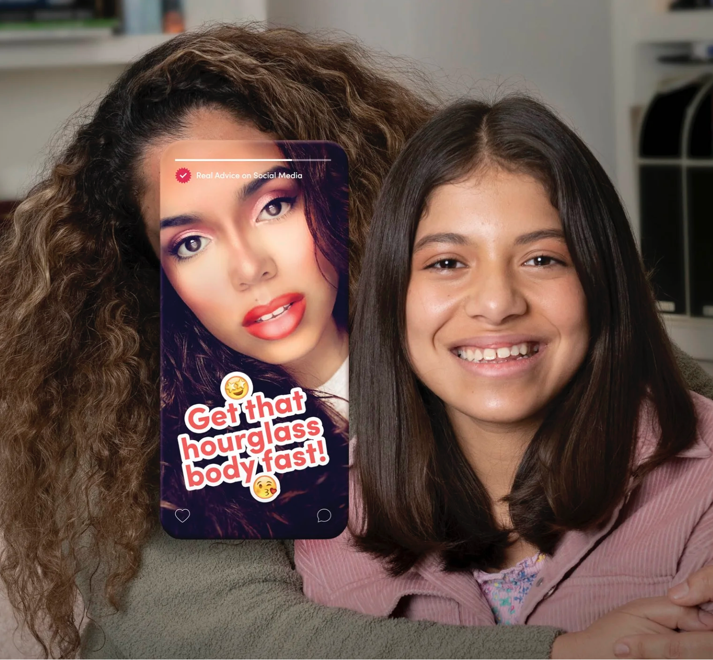
Toxic beauty advice has become so embedded in social culture that it often goes unquestioned. The creative challenge was to visualise this in a way that felt immediate and unsettling.
My role: Lead Designer
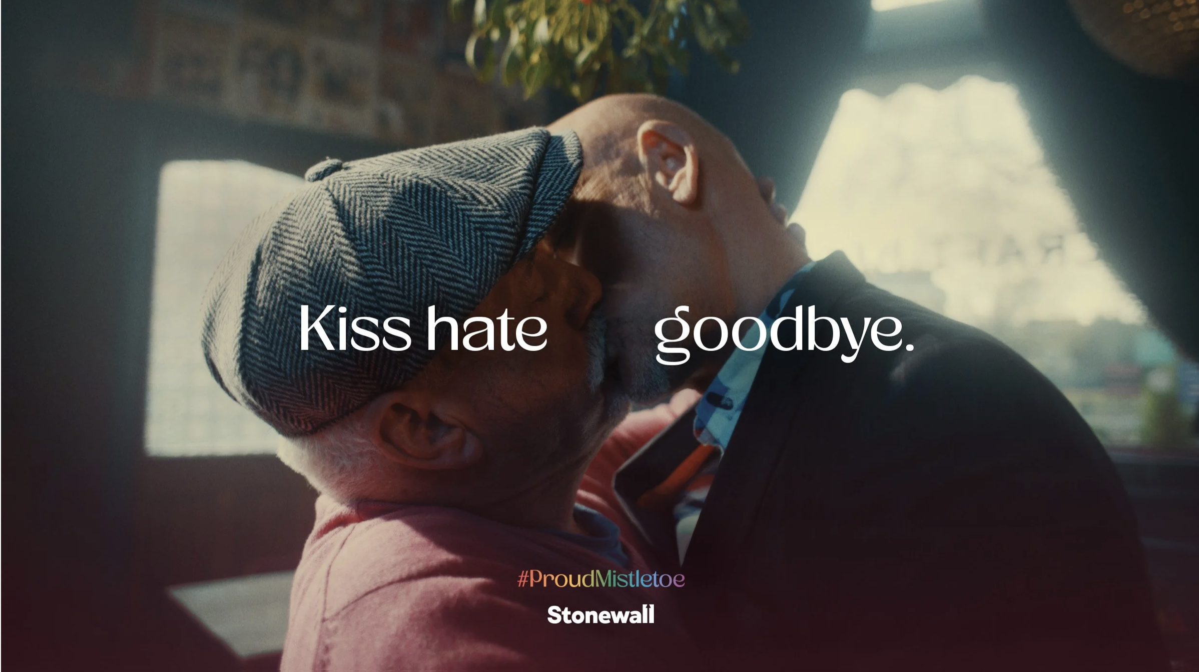
Christmas iconography is built around love and togetherness — yet for many LGBTQ+ couples, public affection can still feel unsafe. The design challenge was to rework a familiar festive symbol into something that stood for visibility and inclusion.
For Stonewall’s first Christmas campaign, the mistletoe was reimagined in a rainbow palette and placed in real locations where homophobic attacks had occurred. The simple act of redesigning and repositioning the object turned it into a statement of pride, reclaiming space through symbolism.
The idea extended across film, social and digital OOH, creating a consistent visual language.
My role: Design Director
Client: Boots
Project: Boots Christmas 2019
Brief: Make it easier to find the perfect gift Christmas gift
Solution: Make a Bootique for every type of person.
Over press, OOH, social, ad van, physical pop-up stores, and build your own Bootique web app, as well as reactive press and social we created over 130,000 Bootiques over the Christmas period.
Client : IBM
Brief
Introduce tennis fans to the IBM AI highlights, which are created live while the games progress throughout Wimbledon 2019.
DOOH, social, digital display
Solution
Tell them what they missed. We created smart posters in the places that people would miss the tennis: stations, airports, cinemas, coffee queues, scrolling through twitter, underground...
We used targeted DOOH and live API to create over 60,000 unique, smart posters and tweets during the tournament. the posters targeted tennis fans with the highlights they'd missed and told them exactly where to go to watch them.
The campaign started as a small local market brief, but was picked up by multiple global markets and as well as the UK, it ran in countries including Spain, Argentina, Japan and UAE as well.
Awards
The Drum OOH awards 2019 - winner
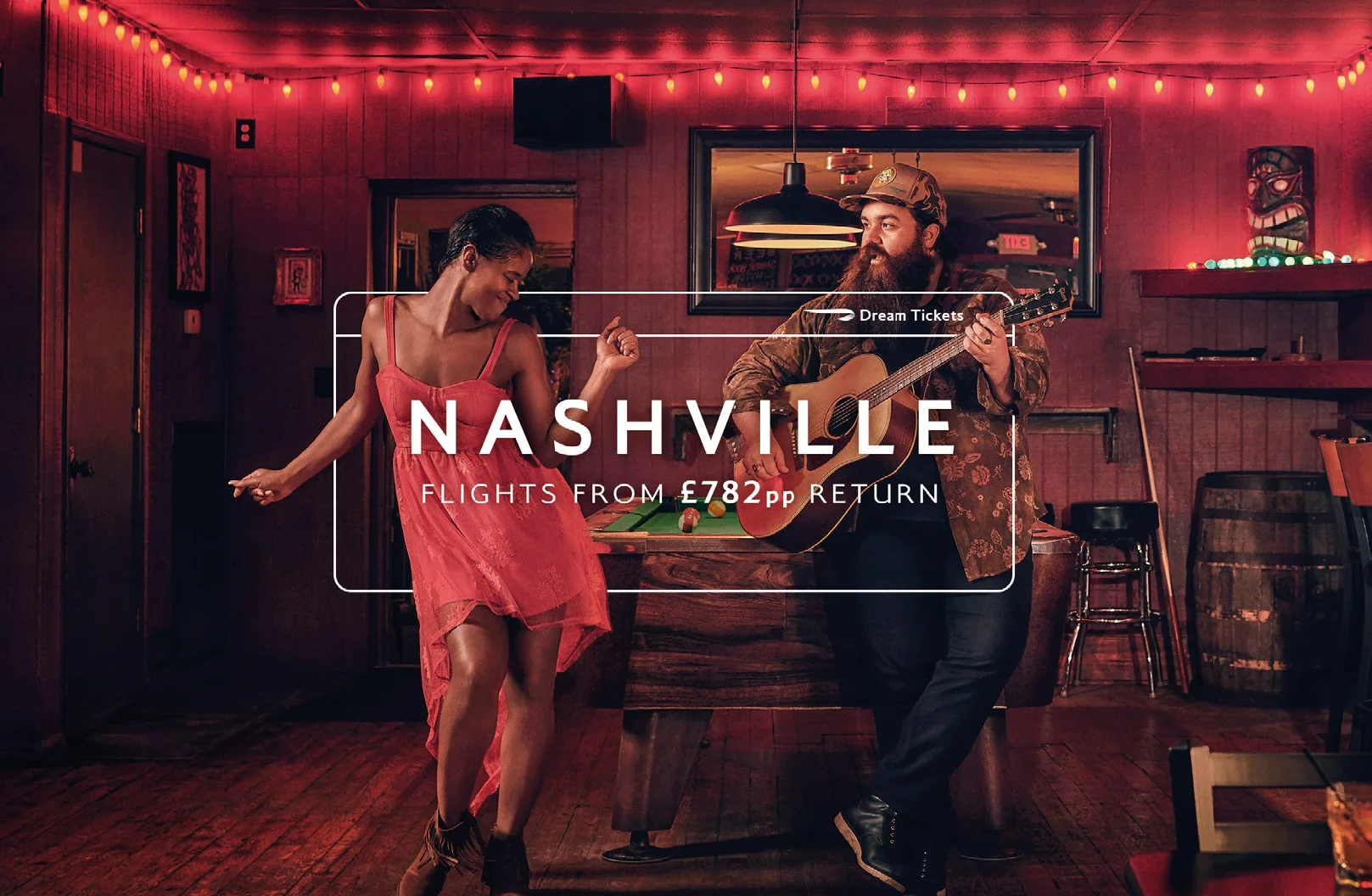
Client: British Airways
Project: Dream Tickets promotional campaign
Brief: Create an own-able look and feel that would sit within the BA brand for the Dream Tickets promotional campaign that would run a few times a year.